
The Ideal Infographic: How to Select the Right Infographic Design for Your Data (PART 2)
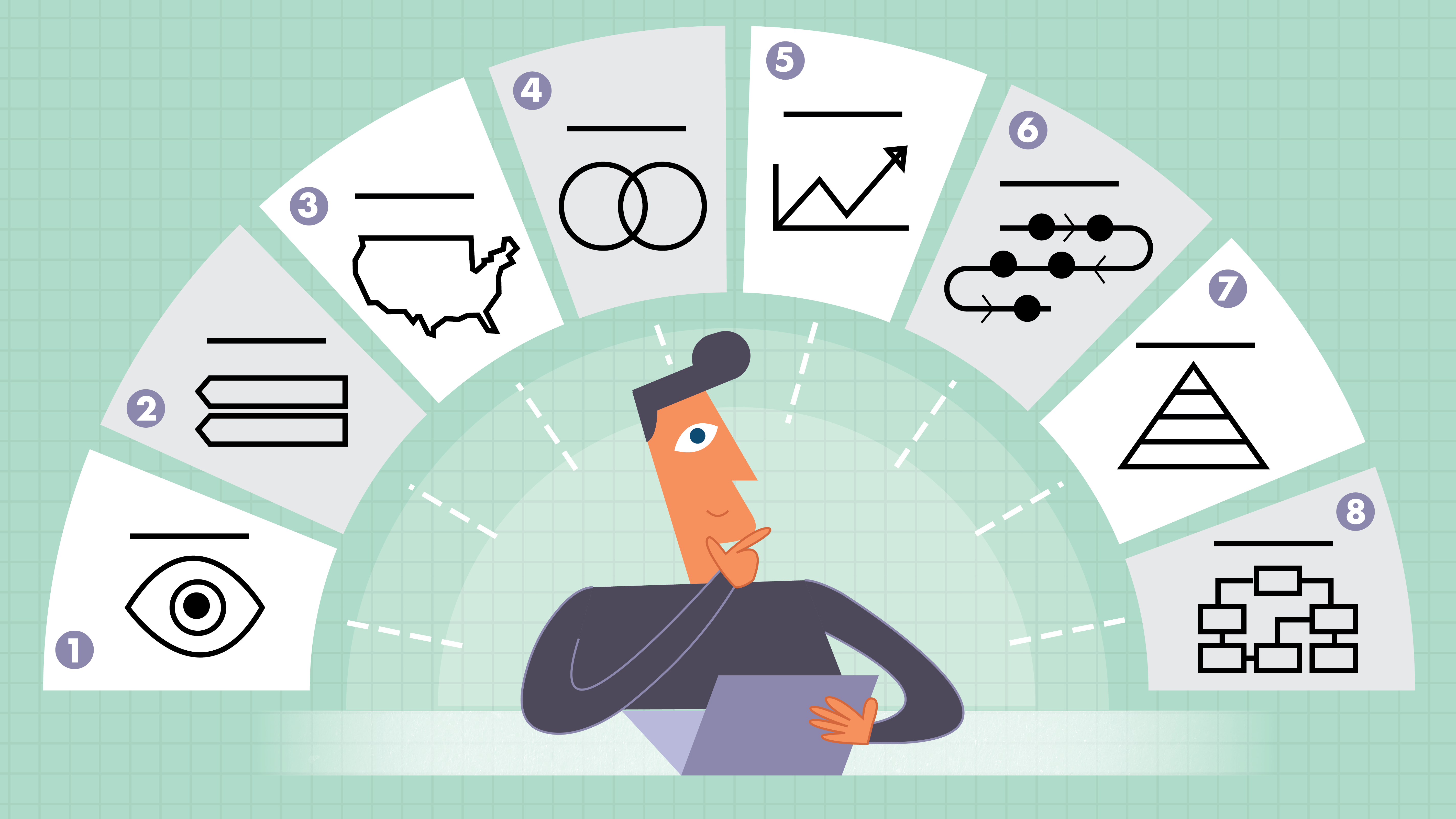
By now you know how important infographics are to today’s internet marketing strategist. But did you know that there are different types of infographic layouts that best suit various categories of information and data? Here’s a brief overview of the 8 most popular and ideal infographic designs in marketing today:
Extracting data and outlining your infographic are only half the battle. Read below to learn about the most popular infographic layouts and which type best suits the data your story has to tell.
1 – Visual
Visual infographics are commonly used to help cut down text-heavy information. Use a visual-based layout if you are wanting to take a simple (or boring) article to the next level.
2 – List-Based
List-based infographics are a great way to share tips, list resources and examples, or to support a claim or argument with a series of steps. This uncomplicated layout type is made more visually appealing by replacing regular list features such as bullet points with topic complimenting icons, fancy fonts, and bold colors.
3 – Geographical or Maps
If your data is location-focused or demographic based, then a geographical infographic may be the way to go. These map-driven layouts are perfect for presenting data based on a specific area. Geographical maps often incorporate charts to visually represent various data points.
4 – Comparison
Thinking of how-to visually stack your brand against a competitor? Comparison infographics are made for just that. With comparison (sometimes referred to as versus infographics) you can easily highlight the difference or similarities between two or more things. You can also utilize this layout style to prove that one option is better or worse than another.
To simplify the layout, most designers split the infographic vertically or horizontally, dedicating each section to an option.
5 – Statistical
Statistical infographics are ideal for data visualization. They offer you an opportunity to take complicated data and information and simplify it via charts, graphs, and icons.
This layout type is commonly used to illustrate survey results, showcase data from multiple sources, and to validate arguing points with relevant information.
6 – Process
Process infographics provide a summary of instructions. These easy-to-understand infographics breakdown complicated process step-by-step.
Process infographics are great for bringing recipes, building instructions, and other step-by-step procedures to life.
7 – Hierarchical
Hierarchical infographics rank information or data from greatest to least.
Examples of common hierarchical infographics include the family trees and organizational structure charts.
8 – Flowchart
When you need to create an infographic that provides personalized results for viewers a flowchart is the best option.
If you have ever taken a Cosmopolitan Magazine quiz, then you are surely familiar with their layout.
Flowcharts are comprised of boxes or shapes that represent different steps or options in a process. The reader selects the options that best suit them until they arrive at their personalized solution or result.
by Isaiah Bradford